My good friends, I need your help again. I have designed three different variations on the cover for Pearseus: Vigil, and I need your help to choose which one to use.
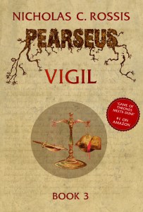
This was my first attempt. I like it, but Electra complained that it was too similar to Schism; as such, people might get confused. So, I moved on to version 2:
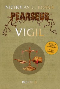
It’s basically the same, but with golden letters and an olive green hue. Not entirely happy with the low contrast of the letter, I also tried a “moss green” (Coreldraw’s terminology, not mine) background:
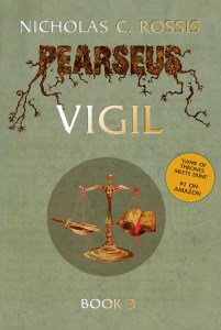
So, which one do you like best? I’d love to hear back from you, and thanks in advance for your help! 🙂

